{{ 'fb_in_app_browser_popup.desc' | translate }} {{ 'fb_in_app_browser_popup.copy_link' | translate }}
{{ 'in_app_browser_popup.desc' | translate }}
{{word('consent_desc')}} {{word('read_more')}}
{{setting.description}}
{{ childProduct.title_translations | translateModel }}
{{ getChildVariationShorthand(childProduct.child_variation) }}
{{ getSelectedItemDetail(selectedChildProduct, item).childProductName }} x {{ selectedChildProduct.quantity || 1 }}
{{ getSelectedItemDetail(selectedChildProduct, item).childVariationName }}
Inks of Stencil Printing
Features key characteristics such as ink smudging, uneven color density, overprint color blending, and rub-off smearing.
A wide selection of print ink colors is available!
RISOGRAPH duplicators used at RETRO PRINT JAM are stencil printers, not standard full-color printers.
Instead, you select your desired ink shades from our palette of 30 available colors, loading them into the machine to print one color per master plate. Conceptually, this process is somewhat similar to running spot-color passes on a four-color offset press.
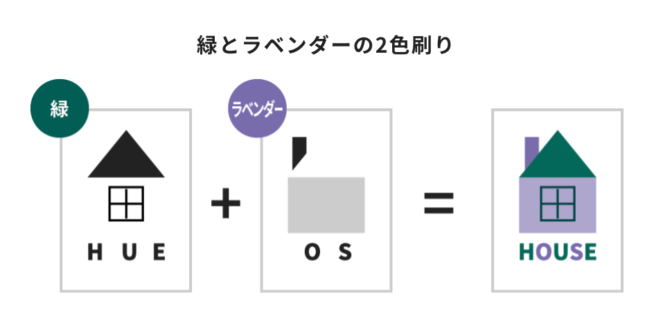
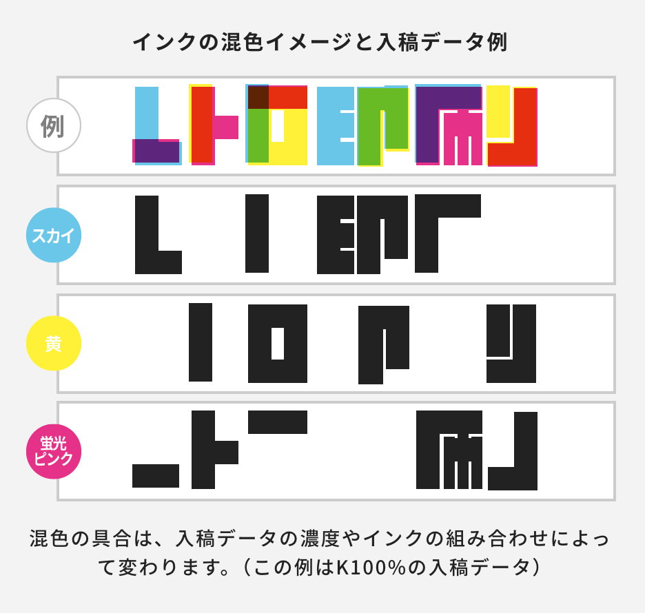
Because of this, artwork must be separated by color, with each layer saved as an individual file. Regardless of the actual ink shade you choose, all artwork files must be prepared entirely in Black & White (Grayscale mode).
Overlapping areas will naturally blend to create a new mixed color!
RETRO PRINT JAM uses semi-water-based emulsion inks that blend together when layered, allowing you to achieve a rich palette using fewer print colors.
When overlapping inks, colors mix much like watercolors or colored pencils—for example, Red over Blue creates Purple, while Blue over Yellow yields Green. If your design features five colors like Red, Blue, Yellow, Purple, and Green, you can achieve all five shades using just three inks (Red, Blue, and Yellow) through intentional color layering.
Because RISOGRAPH machines print a maximum of two colors in a single pass, using more colors requires running sheets through the machine multiple times. Additional passes increase the risk of misregistration and ink smudging. Utilizing overprint color blending keeps your color count low, minimizes print issues, and shortens turnaround times while keeping production costs down.
Overprinting vs. Knockout
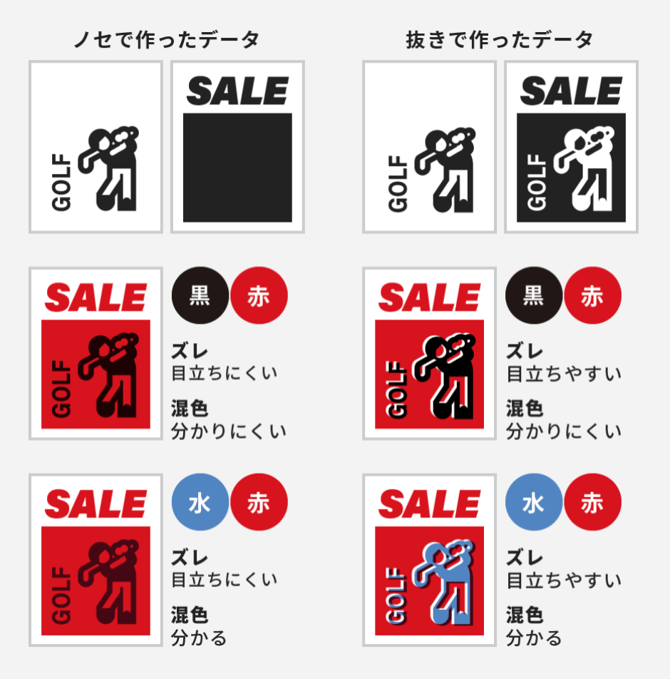
Layering inks directly on top of each other is called Overprinting (ノセ), while cutting out the underlying background to prevent inks from mixing is known as Knockout (抜き).
Using knockout avoids unwanted color blending, but mechanical misregistration becomes much more visible on fine lines and delicate details. On the other hand, heavy dark shades like Black and Navy remain largely unaffected by underlying colors, whether you use knockout or not.
Choosing between the two often comes down to a trade-off: overprinting shifts your colors, while knockout runs the risk of visible misalignment gaps. Weighing both options carefully based on your artwork will help you build cleaner, more intentional print files.
← Left: Overprint Design (ノセ)
Ku (Black) × Ak (Red): Low visibility of misregistration / Low visibility of color blending
Ku (Black) × Miz (Aqua): Low visibility of misregistration / High visibility of color blending
Right: Knockout Design (抜き)
Ku (Black) × Ak (Red): High visibility of misregistration / Low visibility of color blending
Ku (Black) × Miz (Aqua): High visibility of misregistration / High visibility of color blending
Ink Printing Sequence and Color Expression
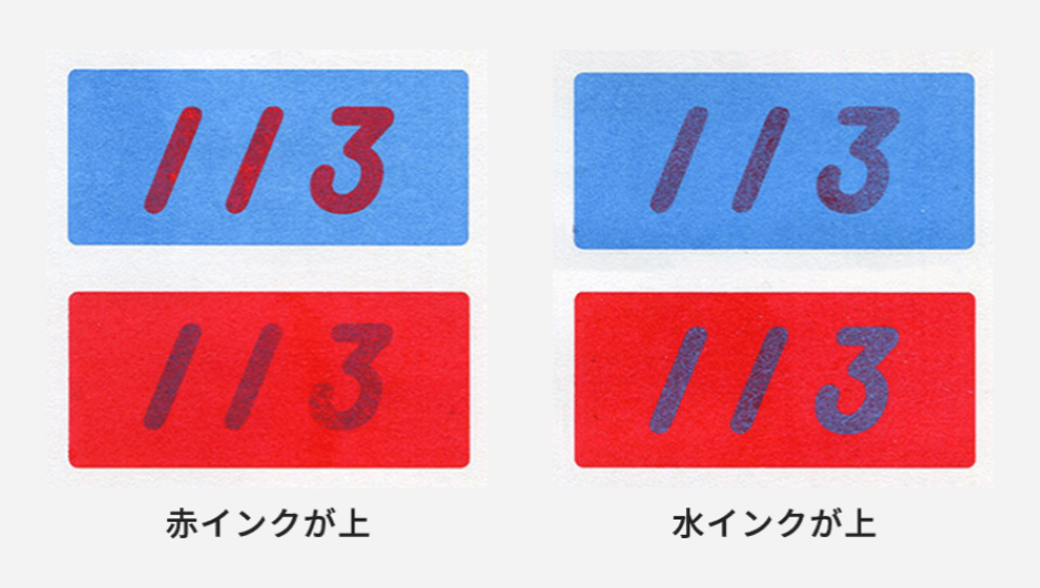
RETRO printing inks look noticeably different depending on which color is printed first.
When you supply a full-color reference preview, our technicians will adjust the print order to match your intended look as closely as possible. If no preview is provided, we default to printing key text or main line art on top. The only exception is Metallic Gold ink, which is always printed last as the top layer.
While specific print sequences cannot be directly requested, you can leave a note specifying your visual preference (e.g., "Ak (Red) on top of Miz (Aqua)"). We will do our best to accommodate your request, though sequence decisions ultimately prioritize delivering the cleanest, highest-quality print possible.
Large, high-density color blocks may show
uneven color blending, patchy coverage, or ink smudging
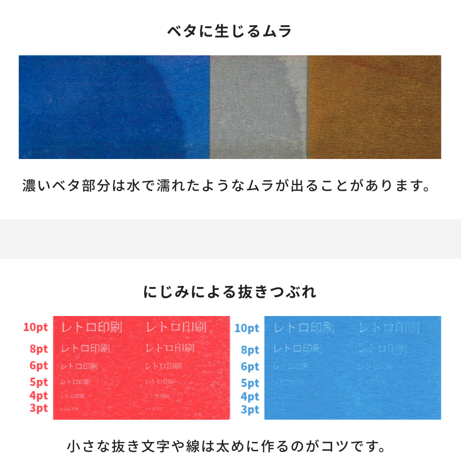
Large areas of high ink density can lead to random color unevenness or mottling.
This effect is most pronounced with large solid color blocks, heavy overprinting, or less absorbent papers. To prevent uneven coverage, consider lowering large solid areas to K80–90%.
Also, because semi-water-based inks bleed slightly, fine knockout lines or small inverted text can easily fill in. We recommend beefing up your line weights to keep details crisp.
Just remember: lowering the background density behind knockout text turns it into a halftone dot pattern, which can also hurt readability. When in doubt, running a test print first is your best bet!
← Top: Uneven Ink Coverage / Density Patchiness Example
High-density solid color areas may show watermark-like print textures.
← Bottom: Ink Bleeding Example
Thickening knockout details is a handy tip to prevent fine lines from filling in.
The ink never fully dries
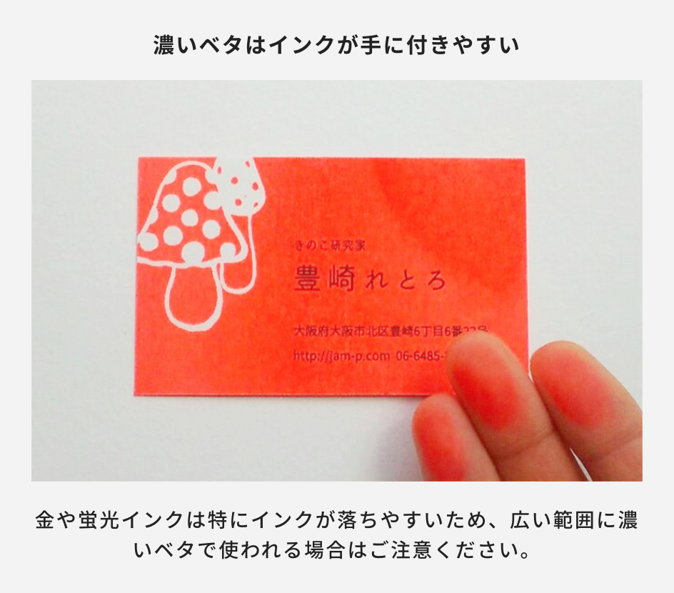
RISOGRAPH inks used in RETRO printing never fully set or cure on the paper.
While this is rarely noticeable on fine text or thin lines, large areas of heavy ink coverage act like fresh, thick paint. Friction or contact with hands and objects can easily cause ink to rub off or smudge—much like handling a daily newspaper. (Any ink transferred to skin can be easily washed off with soap and water, or removed from paper with an eraser.)
To minimize ink rub-off, try the following solutions:
Reduce Ink Density: Lower heavy solid blocks to a tint of K80–90% or lower in your artwork files.
Apply "Tsuyapuri" (Raised Gloss Printing): Use our specialty thermographic finishing service (Japan only). This process coats the ink with a melted resin powder, producing a glossy, raised texture that completely seals the ink and prevents smudging.
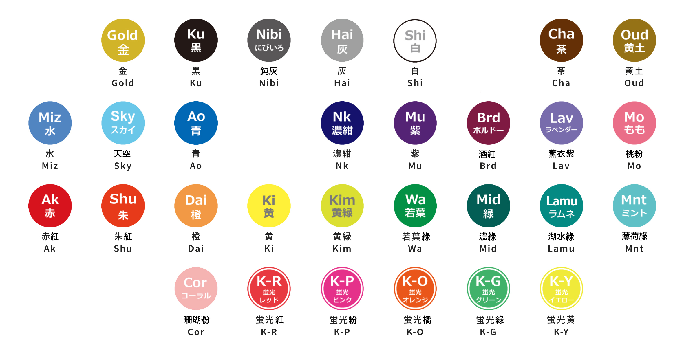
30-Color Ink Palette
水(=水藍)
青(=藍)
濃紺(=海軍藍)
赤紅(=紅)
朱紅(=橘紅)
若葉綠(=綠)
※ 2021/4/9〜原「灰」更名為「鈍灰」(にびいろ)
★ Check print samples for each color on our Japanese website: https://retroinsatsu.com/paperink/ink-list/
(クーヘン = White Paper Series / まっくろ = Black Paper Series)
● Screen colors differ from actual printed results, so we strongly recommend referencing our physical color swatch books.
● Because RETRO印刷JAM uses semi-water-based inks, overlapping colors will blend together. Additionally, ink appearance varies depending on the underlying paper color.
※ Ink Specification Guide
Please include the exact ink name in your file name.
Example: Name the front side Black layer file as Front_Ku.ai.
公司名稱:加慕股份有限公司
(JAM RETRO INSATSU CO., LTD.)
統一編號:42849724
★ 定休日:週一、二
Closed on Mondays and Tuesdays
(絹印工作空間 / 購物 / 網路商店商品訂單出貨:順延)
(印刷檔案確認 / 印刷工作天數 / 印刷物出貨:順延)
※ 其他店面時間異動請參照google行事曆 / SNS公告(fb、ig)
隱私權政策 | 條款及細則 | 運送政策 | 退換貨政策 | J POINT 會員點數 | 2020 © RETRO印刷JAM