{{ 'fb_in_app_browser_popup.desc' | translate }} {{ 'fb_in_app_browser_popup.copy_link' | translate }}
{{ 'in_app_browser_popup.desc' | translate }}
{{word('consent_desc')}} {{word('read_more')}}
{{setting.description}}
{{ childProduct.title_translations | translateModel }}
{{ getChildVariationShorthand(childProduct.child_variation) }}
{{ getSelectedItemDetail(selectedChildProduct, item).childProductName }} x {{ selectedChildProduct.quantity || 1 }}
{{ getSelectedItemDetail(selectedChildProduct, item).childVariationName }}
Printing Characteristics & Precautions
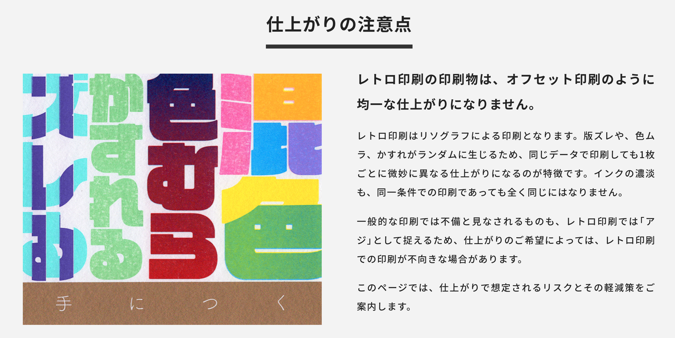
Unlike offset printing, RETRO printing cannot produce perfectly uniform results across every single sheet.
Printed using RISOGRAPH stencil duplicators, our prints naturally feature random misalignments, uneven ink coverage, and minor smudges. Even within the exact same print run, every individual piece carries subtle variations—this is the defining signature of stencil printing. Factors like ink density will never be 100% identical, even under identical conditions.
While commercial printers might view these quirks as flaws, RETRO printing embraces them as charming handcrafted character. However, this means certain designs or intended visual effects may not be suitable for this process.
Below, we detail common printing characteristics along with tips on how to minimize their impact.
Please review and ensure you accept these stencil printing characteristics before placing your order.
[1] Misalignment(Color Shift / 版ズレ)
RISOGRAPH printing layers colors one by one using individual master plates, which naturally leads to misalignment between layers. These shifts occur randomly—while some prints align perfectly, practically every sheet features subtle, unique variations.
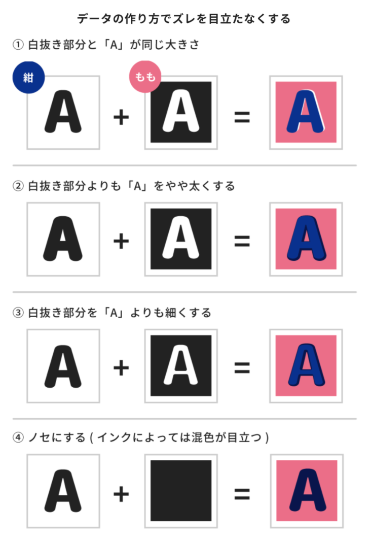
Typical shifts range between 2 mm to 3 mm. By accounting for misalignment during design—such as using trapping (making knockout areas slightly bolder) or overprinting colors directly—you can minimize visible gaps.
① Knockout area matches the precise size of "A"
② Knockout area is slightly larger/bolder than "A"
③ Knockout area is slightly smaller/thinner than "A"
④ Overprinting (no knockout): Colors blend directly upon contact, creating varied mixed hues depending on ink combinations.
Design elements requiring precise alignment will show even a 1 mm shift noticeably. Designs featuring large solid color blocks or multi-color passes are especially prone to paper deformation and greater shifting as sheets pass through the machine multiple times.
リソグラフ印刷は、インクを1版ごとに重ねていく印刷方法のため、版ズレが起こります。版ズレはランダムに生じ、ぴったりと位置が合うこともありますが、基本的には1枚1枚違ったズレ方をします。
版ズレの目安として、最大で2~3mm以内のズレは保証の対象外となります。「抜き合わせ部分をやや太らせておく」「抜きではなくノセにする」(右図)など、あらかじめズレを想定したデータを作成いただくことで、版ズレが目立ちにくくなりますのでご検討ください。
また、細かい位置合わせを要する印刷は、1mm前後のズレでも大きくズレて感じられますので、デザインされる際はご注意ください。特にベタ面積が多いデザインや、印刷機に何度も通す多色デザインでは、用紙の変形によりズレが発生しやすくなります。
[2] Roller Marks (ローラー跡)
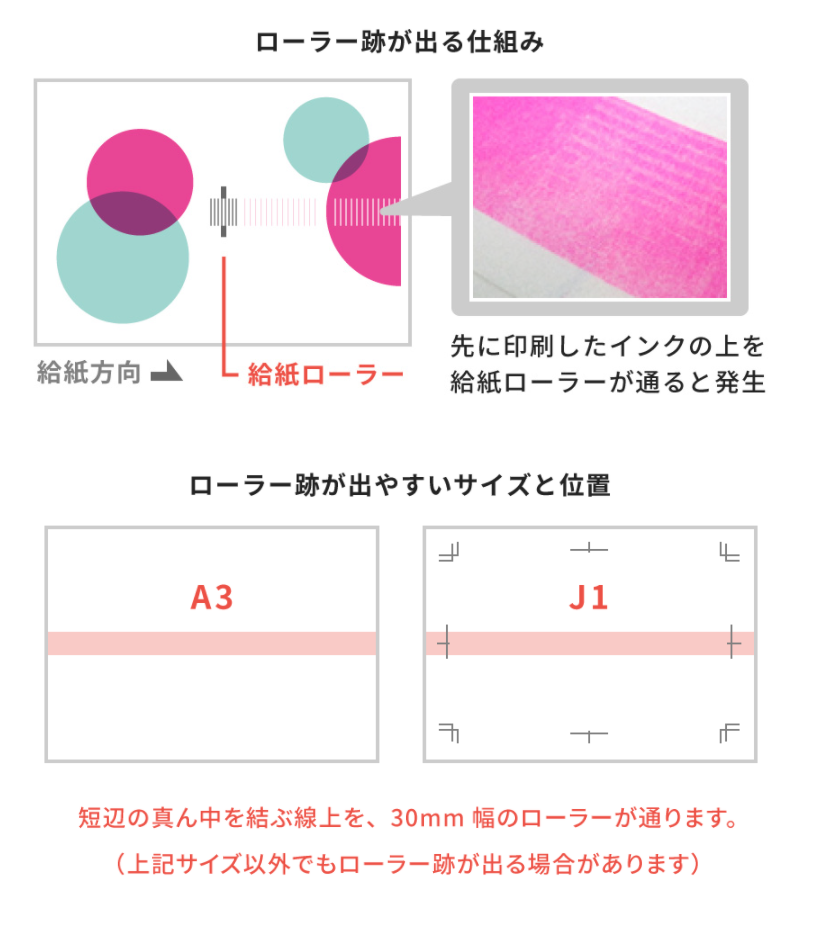
When printing 3 or more colors on one side or printing double-sided on A3, B4, F1, or F2 sizes, a 30 mm wide zone along the center (bisecting the short side of an A3 sheet) becomes a high-risk area for roller marks (ink smudging).
Because a RISOGRAPH machine can print up to 2 colors per pass on a single side, 3-color or double-sided jobs require paper to pass through the machine two or more times. Previously printed ink on the sheet comes into direct contact with the paper feed rollers during subsequent passes, leaving visible tracks known as "roller marks."
For sheet sizes other than those mentioned above, we arrange the print layouts to avoid roller paths, so you generally don't need to worry. However, custom or non-standard print sizes may still encounter this issue.
To minimize roller marks, avoid placing high-density solid color blocks within the central risk zone. Reducing color density in these areas or shifting design elements away from the roller path will effectively reduce the likelihood of smudging.
-->
No.013 "What Are Roller Marks?"
https://retrojamtaiwan-insatsunotane.blogspot.com/2019/06/blog-post_55.html
A3・B4・J1・J2サイズの片面3色以上または両面印刷で、短辺の真ん中を結ぶライン上に、幅30mmほどのタイヤ跡のような汚れが出ることがあります。
リソグラフは1度に片面2色しか印刷できないため、片面3色以上または両面印刷は、印刷機に2回またはそれ以上通して印刷を行いますが、このときすでに印刷されたインクの上を印刷機の給紙ローラーが通ることで発生するのが「ローラー跡の汚れ」です。
上記以外のサイズでは、なるべく給紙ローラーを避けて印刷を行うため、それほど気にする必要はありませんが、サイズやデザインによっては出てしまう場合があります。
ローラー跡が気になる場合は、給紙ローラーの通り道にあるベタの濃度を落としたり、通り道からずらすことで軽減できますのでご検討ください。
[3] Needle Marks(針跡)
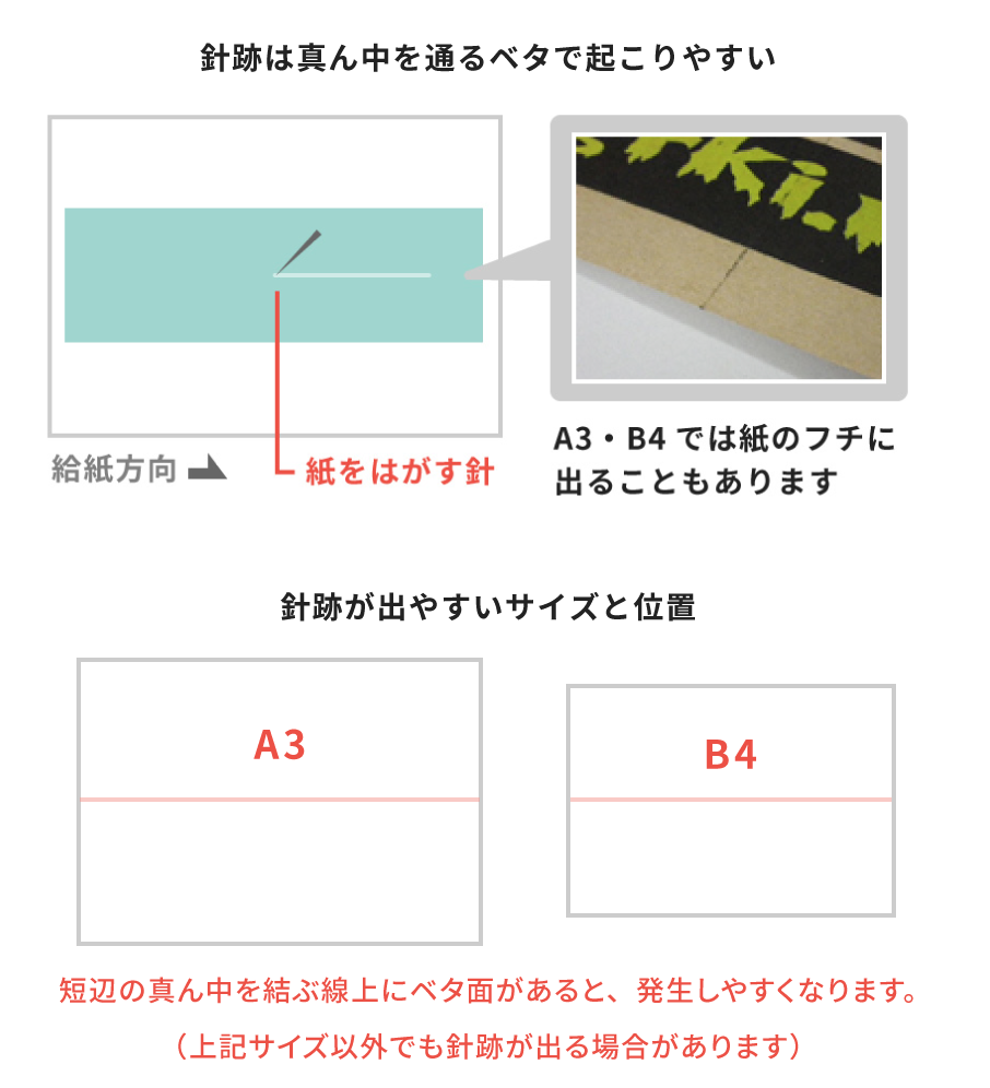
When printing large, high-density color blocks, a thin line resembling a needle scratch may appear along the center zone (bisecting the short side of an A3 sheet).
Freshly printed ink has a slightly tacky surface. As paper passes through the machine, a small needle-like separator component helps peel the sheet off the ink drum. When this part gathers wet ink from large solid color blocks and touches the paper, it can drag a thin ink streak across the sheet.
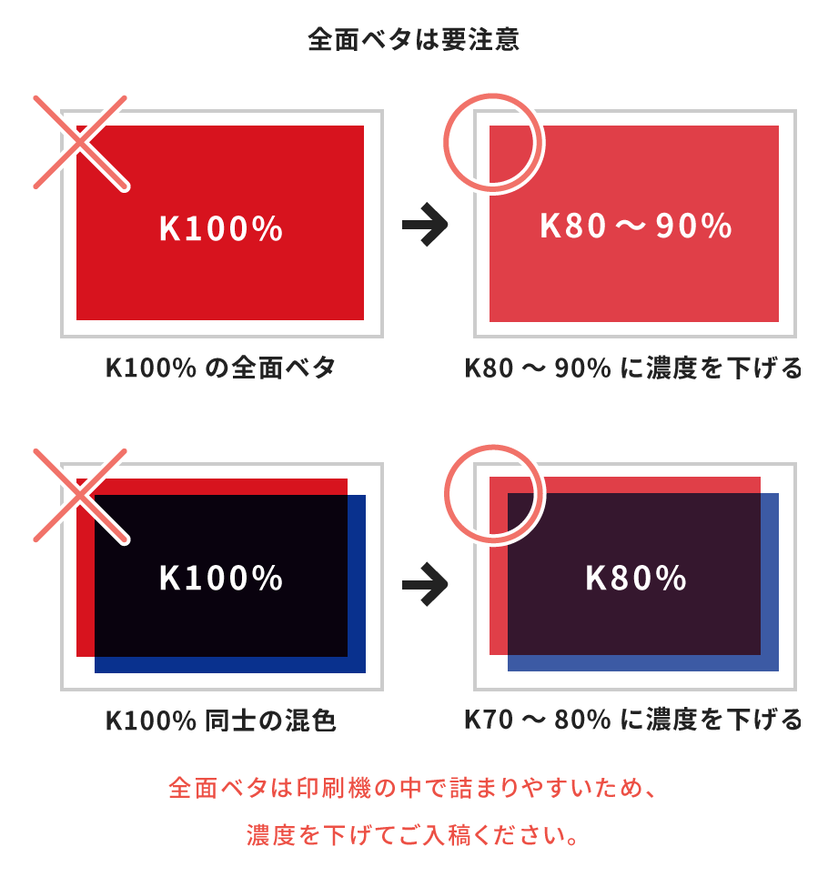
To prevent needle marks, avoid placing dense artwork in the central axis. Alternatively, reducing color density from 100% to 80%–90% helps keep the ink layer thinner and significantly minimizes this effect.
-->
No.012 "What Are Needle Marks?"
https://retrojamtaiwan-insatsunotane.blogspot.com/2019/06/blog-post_25.html
濃いベタ面の印刷が、A3・B4サイズの短辺の真ん中を結ぶライン上にある場合に、このライン上に針で引っかいたような汚れが発生することがあります。
印刷されたばかりのインクは粘り気があり、印刷機の中にある紙とインクドラムをはがすための針状のパーツが、ベタ面を印刷してインクがたっぷり乗っている印刷面に触れてインクを引きずってしまうために起こります。
針跡の発生は、ベタの濃度をK90%~80%程度に下げることで軽減することができます。
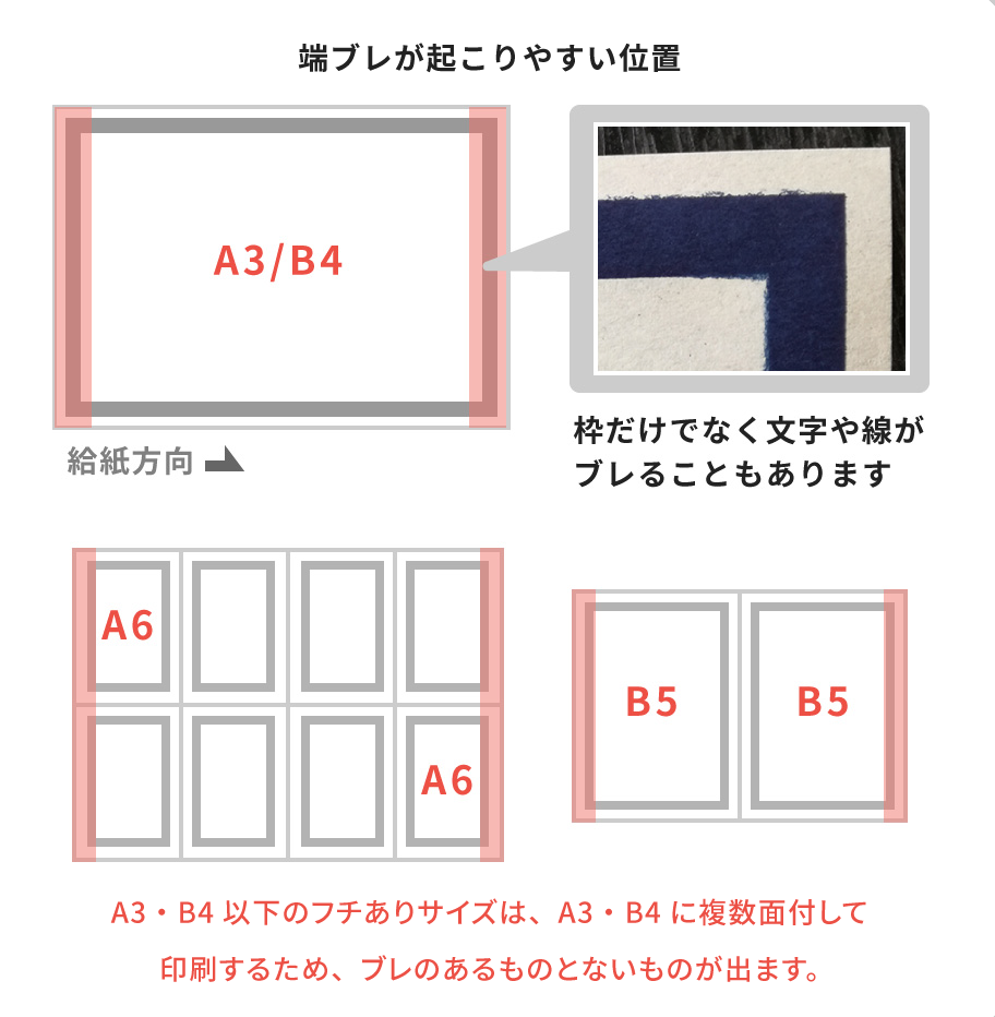
[4] Edge Blurring(端ブレ)
As ink transfers onto paper, the sheet briefly clings to the ink drum. Internal separator needles and air jets then kick in to detach the paper from the drum. When large, high-density color blocks sit near the sheet's edges, the paper releases less smoothly, causing the wet ink along the borders to shift slightly and blur.
While preventing this entirely is difficult, you can minimize the effect by keeping dense blocks away from the margins (e.g., expanding the standard 5 mm border margin to 6 mm or more) or lowering the color density near the paper edges.
This issue typically affects standard non-bleed formats (such as A3 or A4) with heavy edge coverage. Full-bleed print setups, however, are naturally free from this problem.
印刷機の中で印刷された瞬間の紙は、インクドラムに張り付いており、印刷機内部の針とエアー(紙とドラムを分離させる風)ではがして排紙を行います。紙の端に濃いベタがある場合、紙とインクドラムがスムーズにはがれず、紙の端の印刷がブレてしまうことがあります。
完全に回避することは難しいですが、「なるべく短辺の端からベタ部分を離す(フチあり印刷の余白は5mmですが、6mm以上で作成する)」「端部分のベタ濃度を下げる」ことで軽減されます。
断裁前(A3/B4)の状態で紙端に濃いベタがある場合に発生するため、トンボ印刷では発生しません。
[5] Large Solid Color Blocks(ベタの印刷)
Due to the internal mechanics of RISOGRAPH duplicators, printing large, high-density solid color blocks can be challenging. Because the inks contain water, heavy ink coverage often leads to uneven textures or causes thinner papers to warp and wave. Additionally, multi-color prints with heavy coverage carry a significantly higher risk of ink smudging, such as the roller marks and needle marks mentioned above.
If artwork with heavy color blocks causes paper jams or printing equipment failures, our team may contact you to adjust and lower your file's color density.
Most issues in RETRO printing can be resolved by simply reducing ink density. For designs featuring large solid areas, we recommend lowering color density to 80%–90%. For multi-color overlays, keeping individual layers at 70%–80% yields cleaner, more vibrant color-blending results.
リソグラフは印刷の構造上、紙の全面に濃いベタがあるような印刷はあまり得意ではありません。インクは水分を多く含むため、濃度の高いベタ部分はムラや、ペラ紙では波打ちが発生しやすくなります。また、多色印刷の場合は上記「ローラー跡」や「針跡」など、汚れのリスクが高くなります。
ベタによる紙詰まりなどで印刷ができない場合は、お客さまにご連絡の上で濃度を下げさせていただいております。
レトロ印刷で発生するリスクはベタの濃度を少し下げるだけで回避できるものも多いので、全面に濃いベタを用いるようなデザインでは、ベタの濃度はK80~90%程度に、ベタ同士の混色ではそれぞれのインクをK70%程度に下げたデータでのご入稿をおすすめします。
[6] Paper Dust Smudges(紙粉汚れ)
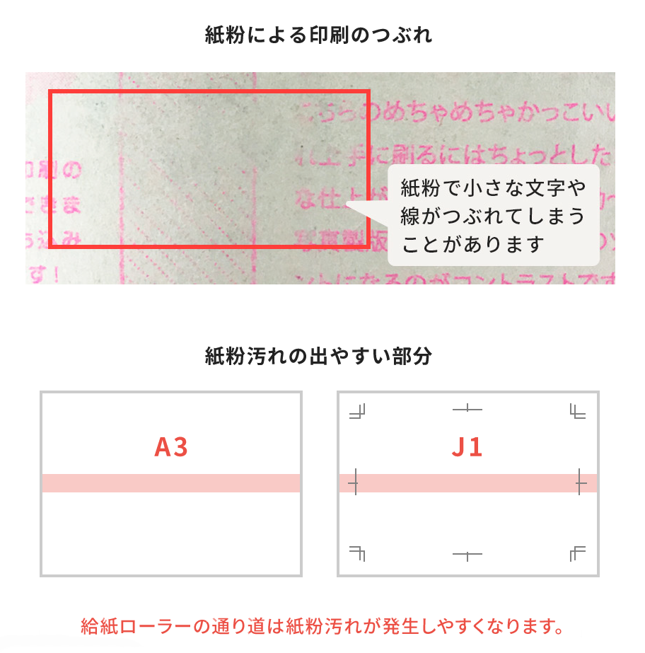
RETRO printing uses papers specially chosen for their high ink absorbency, which are perfectly paired with RISOGRAPH machines. Compared to standard offset printing papers, these stocks produce more paper dust (fine fiber dust attached to the sheet).
Similar to roller marks, paper dust tends to collect along the paper feed roller path. Placing large solid color blocks or fine text within this zone may result in patchy color coverage or illegible lettering.
While our staff takes every measure to minimize paper dust artifacts during production, they cannot be eliminated completely. Smooth surfaces—such as the back of Snow White Paper and Provision Paper—as well as RETRO Paper, Kraft Paper, and Traditional Japanese Color Paper, are especially prone to gathering dust. When designing, we strongly recommend keeping fine text and high-density color blocks away from the central roller path.
レトロ印刷ではリソグラフと相性の良い、インクの吸収が良い紙をそろえているため、一般的なオフセット印刷の用紙と比べて紙粉(紙から出る細かい繊維のほこり)が出やすいです。
ローラー跡と同様に、給紙ローラーの通り道にあたる部分は紙粉が出やすいため、このライン上にベタや小さな文字があると、小さな文字は潰れ気味になったり、ベタ部分には紙粉汚れが目立ちやすくなります。
印刷の際にある程度の紙粉汚れは取り除きながら作業を行っておりますが、完全に防ぐことはできません。
特にハトロン紙・ポッポ紙のウラ面(ツルツル面)や、クラフト紙・レトロ紙・にごり紙は、紙粉が出やすい紙となりますので、給紙ローラーの通り道にベタや細かい文字を配置される場合はご注意ください。
[7] Uneven Borders and Margins(余白や枠の不均等)
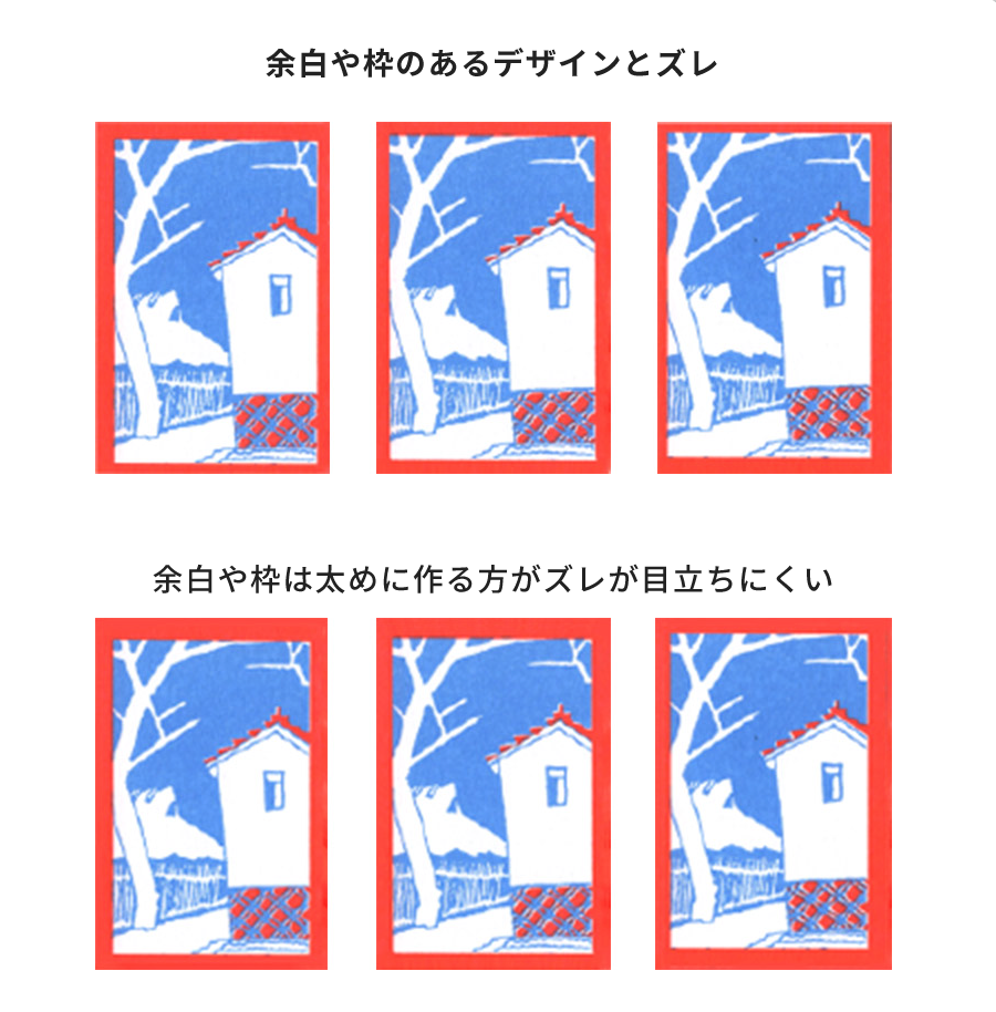
RETRO printing and cutting have an allowable tolerance margin of up to 2–3 mm. As a result, designs with frames or equal margins along all four edges cannot be guaranteed to align with perfectly symmetrical borders or spacing.
This asymmetry becomes particularly noticeable with narrow margins or fine lines placed near the paper edge. To achieve a cleaner finish, we recommend making border lines thicker and setting them—along with any margin spacing—farther away from the sheet edges.
レトロ印刷では、印刷・断裁ともに最大で2~3mmのズレが生じます。四辺に枠のあるデザインや、均等な余白を残すようなデザインは、均等な仕上がりになりません。
枠線は仕上がり線に近く細いほど、フチに余白を残すデザインは余白が狭いほど、ズレが目立ちやすくなります。枠線や余白は、可能であれば太め・広めに配置していただくことをおすすめいたします。
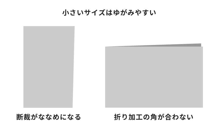
[8] Small Trim Sizes(小さいサイズ)
Manual cutting is guided by visual checks alongside precision machinery. As the final trimmed size gets smaller, slight variations in precision may occur. Additionally, as paper absorbs heavy ink layers, minor warping can happen, resulting in 1–2 mm size shifts or subtle angles.
Our absolute minimum cut size is 30 × 55 mm. While this is the smallest dimension our cutting machinery can physically process, it does not guarantee perfectly uniform right angles across every sheet. Small formats may display slight trapezoidal shifts or minor corner misalignments after folding.
Business card formats and sizes smaller than A6 are particularly susceptible to these tolerance variations. Please keep this in mind before placing your order.
断裁は手作業と目視でメモリ合わせを行うため、小さなサイズになるほど精度が下がってしまいます。(また、インクを吸った紙やツヤプリ加工で熱処理を行った紙は変形しているため、サイズが1~2mm前後したり、若干ゆがんだ仕上がりになる場合があります。)
断裁可能な最小サイズは30mm×55mmですが、これは断裁機で切れる最小サイズであり、精度を保てる基準ではありません。小さなサイズの断裁は少し台形になってしまったり、折り加工では角がぴったり合わないことがあります。
名刺・カードサイズ(レトポミニ)やA6サイズ以下の仕上がりサイズでご注文の場合、これらの注意点をあらかじめご理解いただいた上でご注文ください。
[9] Halftone Screen Dots(網点)
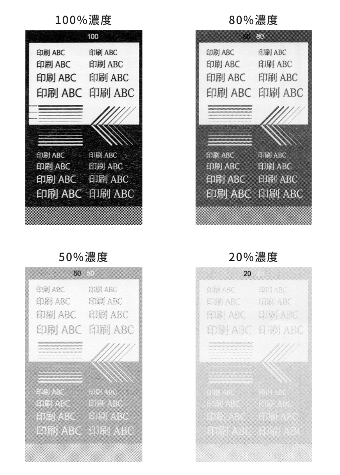
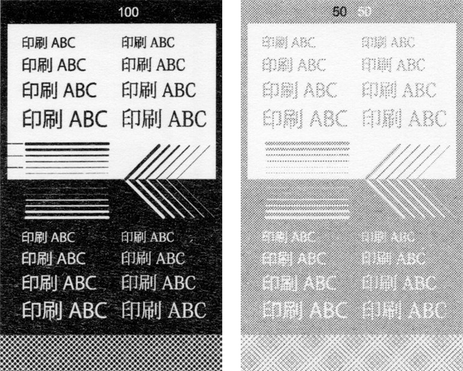
RISOGRAPH duplicators recreate lighter shades and subtle gradients by varying the density and spacing of tiny dots known as "halftone screen dots."
When your artwork file is set to 100% Black (K100), the screen dots print so tightly together that virtually no gaps remain, producing a seamless, solid color block. As you lower the opacity/density of the black value, the spaces between the dots widen, creating a lighter visual shade.
If fine lines or small text are set at low ink densities, sparse dot arrangements can cause lines to break or text to become illegible. Conversely, when creating negative/knockout text inside a color block, low background density paired with overly delicate lettering can impair readability.
To maintain clarity, we recommend keeping background blocks rich and dark (80%–100% density) while setting knockout lines slightly bolder than they appear on screen. Please note that low-density color blocks and screen overlays are also more prone to moiré pattern artifacts.
リソグラフ印刷の濃淡は、「網点(あみてん)」と呼ばれる小さなドットの密度によって表現されます。
入稿データ・原稿上で、黒(K)が100%の濃さのときには網点は大きく隙間なく密接しベタ100%の印刷となります。逆に、黒(K)の濃度が下がると網点は小さく隙間が増えるので、印刷が薄く見えます。
細い線や小さな文字の濃度が低すぎると、網点の密度も低くなるため線の途切れや欠けが生じます。背景ベタ上に抜き文字などを配置するときも、ベタの濃度や文字の大きさ・太さによっては馴染んで読めなくなってしまいます。
小さな文字や細い線は濃い目に、背景ベタ上に抜きを配置する際の背景は濃い目に作成されることをおすすめします。また、濃度の低いドットはモアレが発生しやすいためご注意ください。
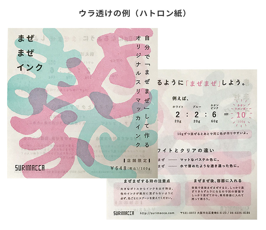
[10] Ink Bleed-Through / Show-Through(ウラ透け)
RISOGRAPH printing relies on paper absorbing the liquid moisture in the ink. Depending on the paper stock and ink choice, ink may bleed or show through to the reverse side of the sheet, making double-sided text harder to read. This effect is most pronounced on thinner paper stocks or with darker, richer inks.
Heavy ink coverage—especially large solid color blocks—significantly increases the likelihood of show-through. If this is a concern for your design, we recommend lowering the color density or offsetting heavy artwork elements on opposing sides so they don't directly overlap.
リソグラフ印刷は、紙にインクの水分を吸わせて印刷するため、紙やインクの種類によっては印刷が紙の反対側に透けて、文字などが読みづらくなってしまうことがあります。
濃度が高い印刷(特にベタ部分)ほどウラ透けは起こりやすいため、ウラ透けが気になる場合は濃度を下げてご入稿ください。
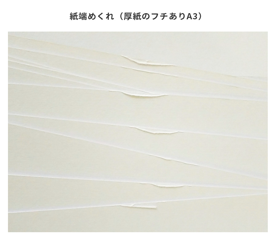
[11] 厚紙邊緣破皮(厚紙の紙端めくれ)
因為紙張較厚,進紙時和機器的零件摩擦,讓紙的邊緣有點被掀起的情況是有可能發生的(工作人員會盡量調整,但有時候無法完全避免)。厚紙A3/A4非滿版以外的規格(滿版規格),基本上皆會進行裁切,因此不會有這樣的情形產生。
※厚紙印刷製作過程中,為防止油墨互相沾染,會在每一張厚紙印刷物之間加入一張襯紙(無印刷的紙)的狀態進行出貨。
※有些規格的多色印刷/雙面印刷可能較容易出現滾輪痕跡(如非滿版A3、滿版F2)。
※同樣的設計檔案,使用厚紙與薄紙印刷時,無法保證能製作完全一樣的印刷物。
厚紙のフチありA3サイズは、給紙時の摩擦で紙端にめくれが発生する場合があるため、フチ幅を10mmとさせていただいております。(フチ部分は印刷されないため、実際の印刷可能範囲は277×400mmとなります。)
フチありA3サイズ以外の厚紙印刷は、余白フチの有無に限らずすべて裁ち落とし仕上げとなるため、紙端のめくれは発生いたしません。
[12] 金色・螢光色油墨的塞孔(金・蛍光インクの目詰まり)
「塞孔」指的是:用來印刷的版上面的孔洞產生塞住、油墨無法通過的現象。尤其是「金色」「螢光色」油墨因其特性,較容易產生塞孔的情況(金色油墨較為特殊,除了容易塞孔之外,因為金粉的特性覆蓋性較強,也不建議用於混色)。
螢光色(尤其是「螢光黃」)的油墨容易掉色,即使調整印刷的順序,也一樣會產生塞孔情況,不建議用來進行混色,也無法指定油墨的上下層順序。
【避免/減輕塞孔的POINT】
・以能夠接受可能塞孔的情況下使用螢光色油墨
・能夠接受螢光色印刷在最上層( = 螢光色的顯色較強烈)
・避免混色(製作鏤空)(但是因為錯位,交界的邊緣還是可能斑駁)
・將螢光色的濃度降低
(降到K70%左右可以大致減輕,但仍可能無法完全避免)
・使用其他非螢光色的油墨
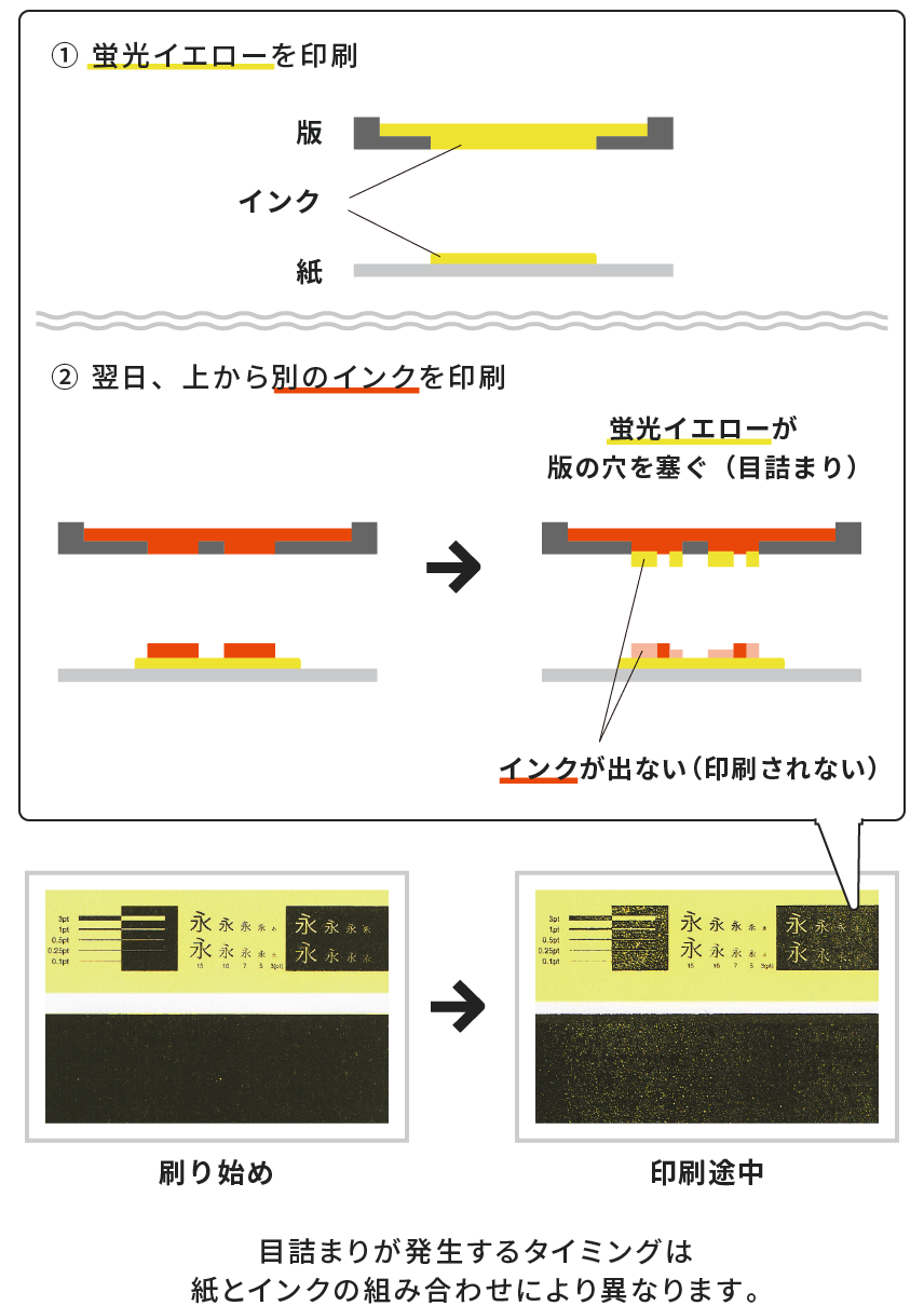
「目詰まり」とは、印刷の元となる版の孔が詰まり、インクが出なくなってしまう現象です。特に「金インク」「蛍光インク」はインク落ちしやすく、目詰まりが発生しやすい特徴があります。金インクは目詰まり以外の注意点も多いため、詳細は「金インクの注意点」をご確認ください。
蛍光色(特に蛍光イエロー)はインク落ちしやすく、印刷の際に日付を跨いで上に別のインクを印刷すると目詰まりを起こし、(上に印刷したい版の穴を塞いでしまい)上に重なるインクがうまく出なくなってしまうといった特性があります。ご希望の重なり順での印刷が難しい場合もありますので、ご注意ください。
【目詰まりを回避・軽減するポイント】
・目詰まりリスクご了承の上で、蛍光インクを使用する
・蛍光インクを一番上に印刷する(上に重なるインクの色味が強い仕上がりになります)
・2色印刷の場合は下に、3色以上の印刷の場合は上から2番目になるよう印刷する。
・混色を避ける(白抜きを作る)
・蛍光版の濃度を下げる(K70%程まで下げていただくことで軽減は可能ですが、紙とインクの組み合わせによっては濃度を下げても目詰まりする場合があります)
・別の通常インクへの変更
[13] 網點網花(トーンモアレ)
網點設計可能因為一些原因而產生「網花」的現象。
【網花的主要發生條件】
・使用不同線數・角度的網點
・解析度較低,造成邊緣有鋸齒狀(沒有進行二階調處理)
・使用濃度較低的網點
・網點形狀變形(非正圓形的網點)
・網點製作後有進行放大縮小等變形
-->
No.037 「漫畫網點 x RETRO孔版印刷 = 網花?」
https://retrojamtaiwan-insatsunotane.blogspot.com/2024/07/no037-x-retro.html
トーンデザインはモアレ(格子状の模様)が出る仕上がりとなる場合があります。
【モアレの主な発生条件】
・線数・角度の異なるトーンが重なっている
・アンチエイリアスがかかっている(二値化されていない)
・濃度の低いトーン
・形が変形している(正円以外のトーン)
・トーン生成後に縮小している
[14] 漸層斷層(グラデーション割れ)
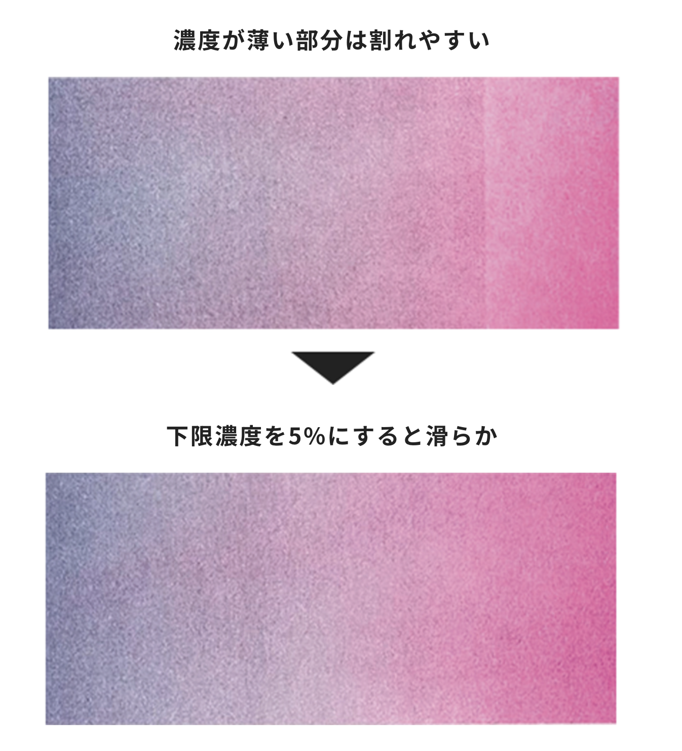
RETRO孔版印刷在滑順漸層的表現上較為苦手,有可能會產生一段段的斷層效果,或是在3~5%的地方直接斷層變成白色的效果。
尤其是較淺的濃度部分較容易產生斷層,避免的方式是將最低濃度改為5%開始,或是使用自製網點的方式製作漸層。
-->
No.038 「漸層斷層的真相 ~今天斷層?不斷層?~(網點特殊效果測試)」
https://retrojamtaiwan-insatsunotane.blogspot.com/2024/10/no038.html
レトロ印刷のグラデーションは0%に向かって消えゆく部分の表現が苦手で、段階的に分かれて印刷されたり、3~5%あたりでパキッと割れ白く飛んだような仕上がりになる場合があります。
特に薄い濃度のストロークが長いと割れやすくなるため、グラデーション下限濃度を5%までにしたり、トーンなどの点描にすることで割れが目立ちにくくなります。
[15] QR code類(QRコード類)
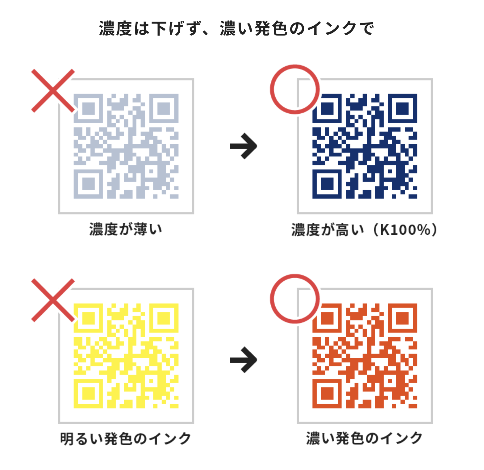
由於油墨的滲透與擦痕的效果,可能會造成QR code或條碼類無法讀取的現象(無法讀取的情形無法提供賠償)。建議先行試印,或是在QR code旁附上連結,以防萬一。
濃度低的K值%會以網點呈現,會造成讀取上的困難,因此建議以K100%製作。
另外是油墨與紙張搭配的顯色程度,也會影響QR code的掃描效果。尤其是淺色系(例如黃色)、螢光色系、粉彩色系(例如珊瑚粉)等較亮色的油墨,都可能為造成無法讀取的情形,需要特別注意。
インクのにじみやカスレが発生するため、QRコードやバーコードなどは読み取りができないことがあります(QRコード・バーコード類の読み取り可否は補償対象外です)。リンク先のURLなどはQRコードと一緒に記載することをお勧めします。
濃度が低いと網点となって印刷されるため、読み取りができなくなります。QRコードは濃度100%で作成ください。
また、紙とインクの組み合わせによっては読み取り自体ができないこともあります。特に黄系や蛍光インクなどの明るい発色のインク、パステル系のインクはご注意ください。
-->
【ラボ】QRコード読み取れますか?
https://jam-p.com/blog/lab-qrcode/
檔案的濃度沒問題嗎?混色這樣做OK吧?
像這樣不是很確定的時候,歡迎使用試印服務。
公司名稱:加慕股份有限公司
(JAM RETRO INSATSU CO., LTD.)
統一編號:42849724
★ 定休日:週一、二
Closed on Mondays and Tuesdays
(絹印工作空間 / 購物 / 網路商店商品訂單出貨:順延)
(印刷檔案確認 / 印刷工作天數 / 印刷物出貨:順延)
※ 其他店面時間異動請參照google行事曆 / SNS公告(fb、ig)
隱私權政策 | 條款及細則 | 運送政策 | 退換貨政策 | J POINT 會員點數 | 2020 © RETRO印刷JAM